The EASIEST Way To Create A Custom Mobile Website With Squarespace
Hey friends! Layla here. When I first started designing websites, I was OBSESSED with doing custom Canva graphics (I still am). However, I quickly realized I was designing graphics that looked great on my laptop—but not so great on a phone. Squarespace doesn’t allow independent editing of the mobile vs. desktop version of your website. This is both a great—and annoying—aspect of designing with Squarespace. Fortunately, there’s a workaround, which I’m going to walk you through here.
Let’s say you’ve designed the perfect homepage for your website. It looks GREAT. Then, you click over to view the mobile version and…it’s terrible. Ugly, even. What do you do?
Easy. You’re going to create two separate homepages for your website: one for people viewing your site on a desktop, and another for people looking at it on a phone.
STEP 1:
Design both a desktop page version and a mobile page version in Canva (or wherever you create your graphics).
STEP 2:
Upload each graphic in SEPARATE sections to your website.
As you can see here, the version we uploaded that’s designed for mobile looks pretty weird when we see it in desktop view. But when we look at it in mobile view…
Now, we just have to figure out how to hide the mobile version from the desktop view, and the desktop version from the mobile view.
STEP 3:
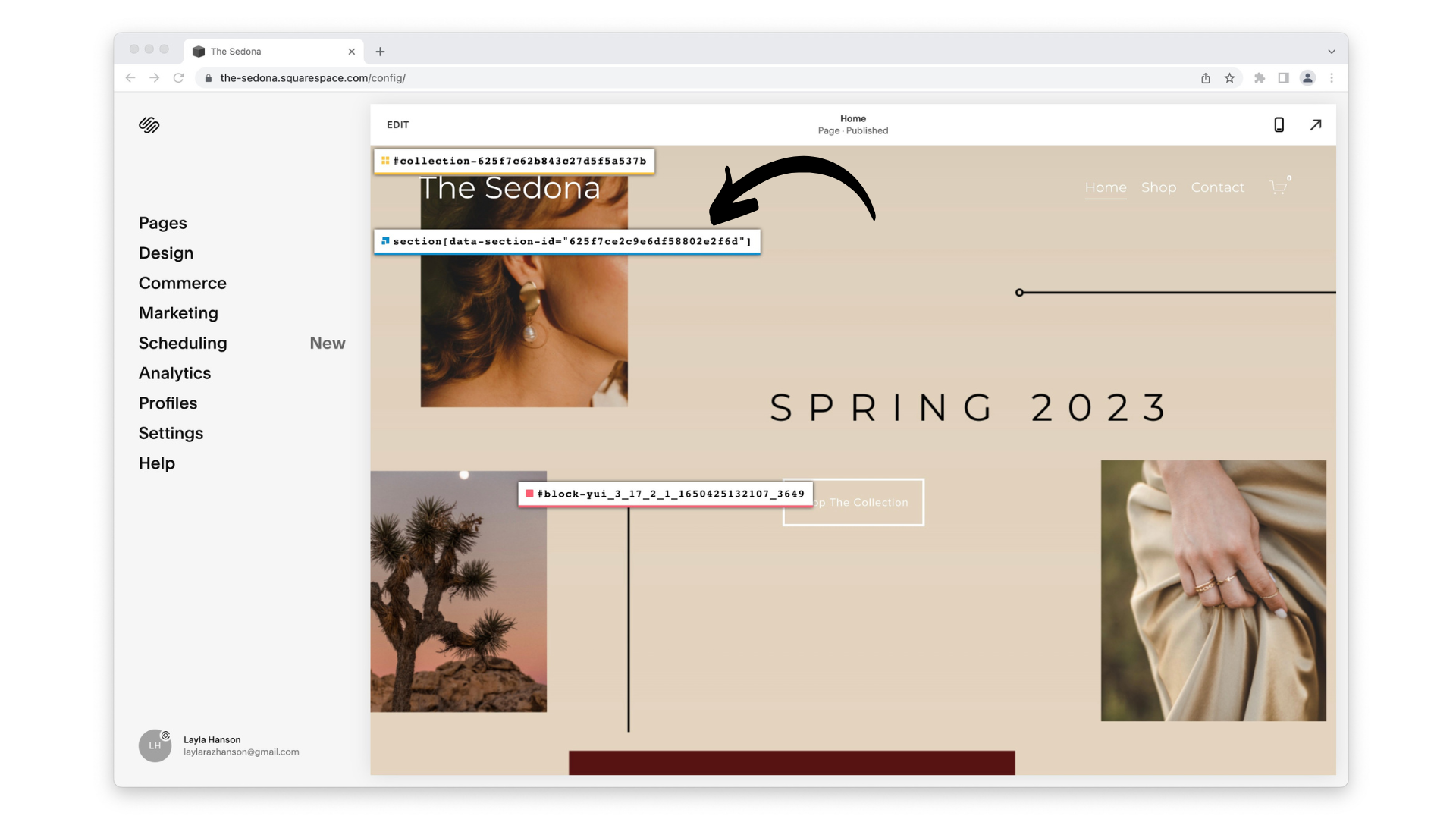
Download Squarespace ID Finder. You WILL need this at some point if you have any interest in doing fun/fancy things with your website, so trust me, just download it. It’s 100% free and 100% helpful.
Once you’ve downloaded the ID Finder, log into your Squarespace website on Chrome. Click the ID Finder button in the top right corner.
You’re going to see a bunch of crazy-looking numbers pop up. You want the ones in blue.
STEP 4:
Copy each of the section IDs you want to swap. All you have to do is click on it, and ID Finder will automatically copy it. Go ahead and paste this in the Notes app, a Word document, etc. Make sure you remember which section was designed for mobile vs desktop.
Almost there. Now, deep breaths: you’re going to use some code.
STEP 5:
// Hiding and showing sections for mobile and desktop
@media screen and (max-width: 641px) {
section[data-section-id="HIDE-FROM-MOBILE"] {
display:none !important;
}
}
@media screen and (min-width: 641px) {
section[data-section-id="HIDE-FROM-DESKTOP"] {
display:none !important;
}
}
Copy this code to your Notes app/wherever. The part of the code that’s in bold is what you’re going to replace using those section IDs from earlier. So using the section IDs we grabbed from ID Finder, our new code would look like…
STEP 6:
Copy this code completely, and head back over to Squarespace. Go to Design -> Custom CSS. Paste the code into the code box.
Make sure you hit save, and then guess what? You’re done! Congrats, you little tech nerd. We love to see it.
PS: If you want to hide/swap multiple sections between mobile vs desktop view, just use the code above and separate sections with a comma. For example:
// Hiding and showing sections
@media screen and (max-width: 641px) {
section[data-section-id="HIDE-FROM-MOBILE"],
section[data-section-id="HIDE-FROM-MOBILE"],
section[data-section-id="HIDE-FROM-MOBILE"] {
display:none !important;
}
}
Drop a comment below if you have any questions. If you want to watch a video version of this tutorial, you can do that here. You can also email us at hello@rozdesign.co or check out our TikTok or Instagram. And if you read this tutorial and died a little inside, no worries—we offer design services so you deal with exactly zero code.
Cheers,


